Exhibit 3 - USU Stars Digital Display
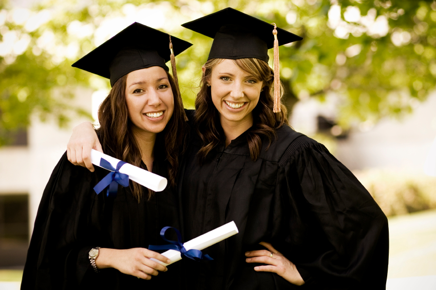
Before
|

After
|
Design Thoughts:
This digital display was created for the USU Stars! Gear Up program.
This digital display was created for the USU Stars! Gear Up program.
- Contrast: The black cap and gown create a contrast against the softer background, and a similar contrast idea is created with the black text.
- Repetition: The black text and the cap and gown use the same color.
- Alignment: A grid was used to make sure that everythign was aligned properly. The text follows the same line as the faces.
- Proximity: The text is located on the right side of the image, and breaks up some of the blurred background making it stand out.
- Color: The text is the same color as the cap and gown, and the background colors create a contrast with the dark colors of the main image.
- Typography: The text is simple, but makes a strong point. Two fonts were used to show contrast with serif and sans-serif fonts, but the fonts compliment eachother well.
- Using Camera Raw, the Contrast, Whites, and Clarity were increased, and the Highlights, Blacks, and Vibrance were decreased.
- The Hue and Saturation were also modified in Camre Raw, by decreasing the oranges for better facial color, increasing the greens to bring out the trees in the background, and increasing the blues to make the ribbons stick out more.
- The image size was also increased, and the left side of the photo was cropped so that the girls were aligned left to allow for better placement of the text.
- Another slight crop was doen in Photoshop.
- A text layer was added.
- A guide layout was used for alignment purposes.
- Fonts Used - Bernard MD Condensed & Franklin Gothic Heavy
- Image Credit - http://www.darwinsfinance.com/college-students-go-right-to-grad-school/
