Exhibit 5 - Informational Flyer
Design Thoughts:
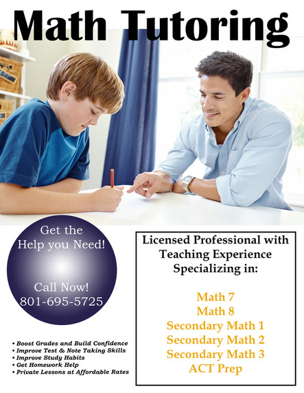
This informational flyer was created for my private math tutoring business.
This informational flyer was created for my private math tutoring business.
- Contrast: Several colors and styles were used for the fonts to create contrast. The rectangular border creates contrast. The darker bluse circle creates contrast with the background as well.
- Repetition: The black font was used several times within the flyer, and is the same as the color of the rectangle. The blue circle and yellow text are similar hues to colors from the image.
- Alignment: The text lines up and is centered.
- Proximity: All of the pertinent information is located clos ein proximity to make it easy to read and find.
- Color: Similar hues of blue, orange, and black are used throughout the design.
- Typography: A serif font was used for the main text, to contrast the sans-serif font used in the heading, and different colors were used for the text to provide contrast.
- After adding the image to Photoshop, it was quite small and needed to be resized.
- The free transform tool was used to extend the picture to the edge of the background after resizing it.
- The text layer was added at the top so that it would overlap the photo.
- The elliptical marquee tool and the gradient tool were used to create the circle.
- The rectangle tool was used to highlight the text on the bottom right of the page.
- Several different layers of text were added using a serif font to contrast the sans-serif font used in the heading.
- The text layers had to be rearranged so they appeared on top of the shapes created.
- Photo credit: http://www.mathplusnj.com/home/
- Fonts used: Britannic Bold & Bookman Old Style
