Exhibit 4 - Clipping Layers
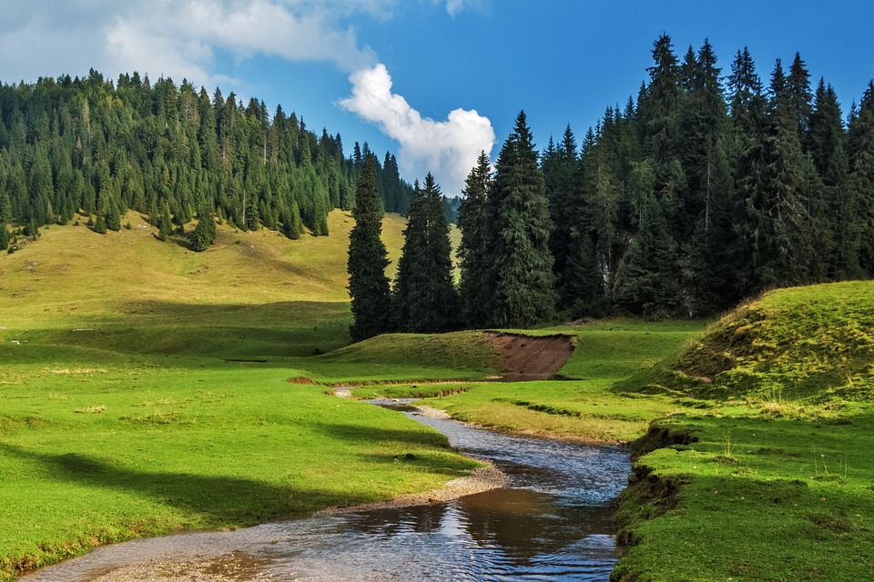
Before
|
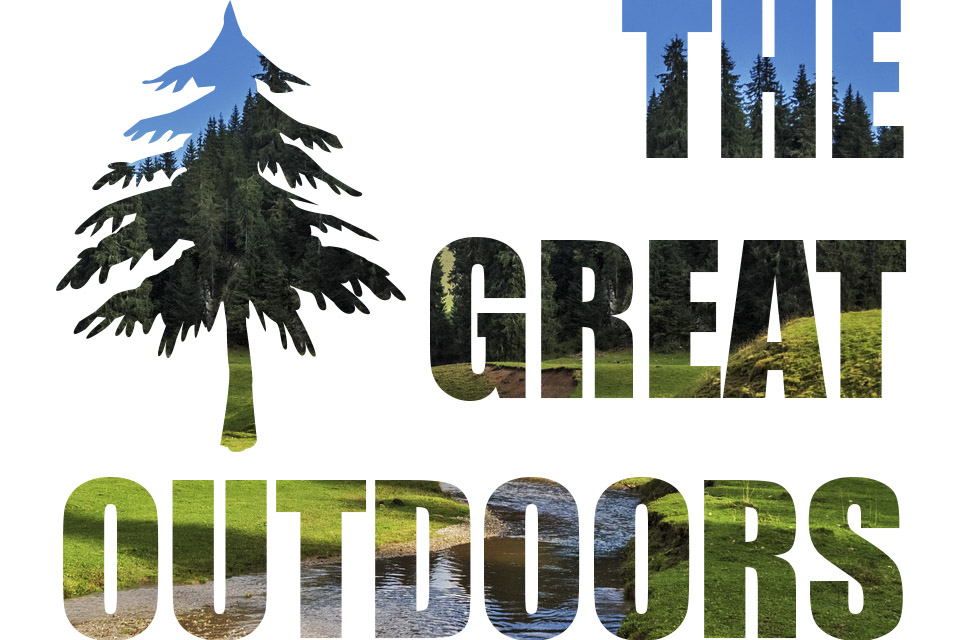
After
|
Design Thoughts:
I wanted to create a representation of the outdoors with text. I did not feel like the photo itself needed any editing in Camera Raw.
I wanted to create a representation of the outdoors with text. I did not feel like the photo itself needed any editing in Camera Raw.
- Contrast: The white background provides a big contrast with the colors in the lettering. Also, the blue sky contrasts the greenery for a nice look within the text.
- Repetition: All text is in caps and the same font. The tree repeats the same visual as the text.
- Alignment: The text is all aligned right ont he same line, and the tree aligns on the left and top with the text as well.
- Proximity: The tree is in close proximity to the lettering.
- Color: The colors of the picture were already so vivid, that they really stand out in letters. The tree image repeasts the same blue, dark green, and light green colors as the text.
- Typography: All text is the same bold size and font
- The type tool was used to create the text.
- Background image was moved above the text in the layers panel, and then clipped to the text.
- The custom shape tool was used to create the tree.
- The free transform tool was used to resize and place the tree.
- A copy of the image background layer was created and clipped to the tree shape.
- The background image clipped to the tree was moved horizontally so that the area showing in the tree more closely resembled the look of the lettering.
- Image from: https://pixabay.com/en/landscape-nature-forest-sunshine-967630/
- Font used: Impact
