Exhibit 9 - Digital Display
Design Thoughts:
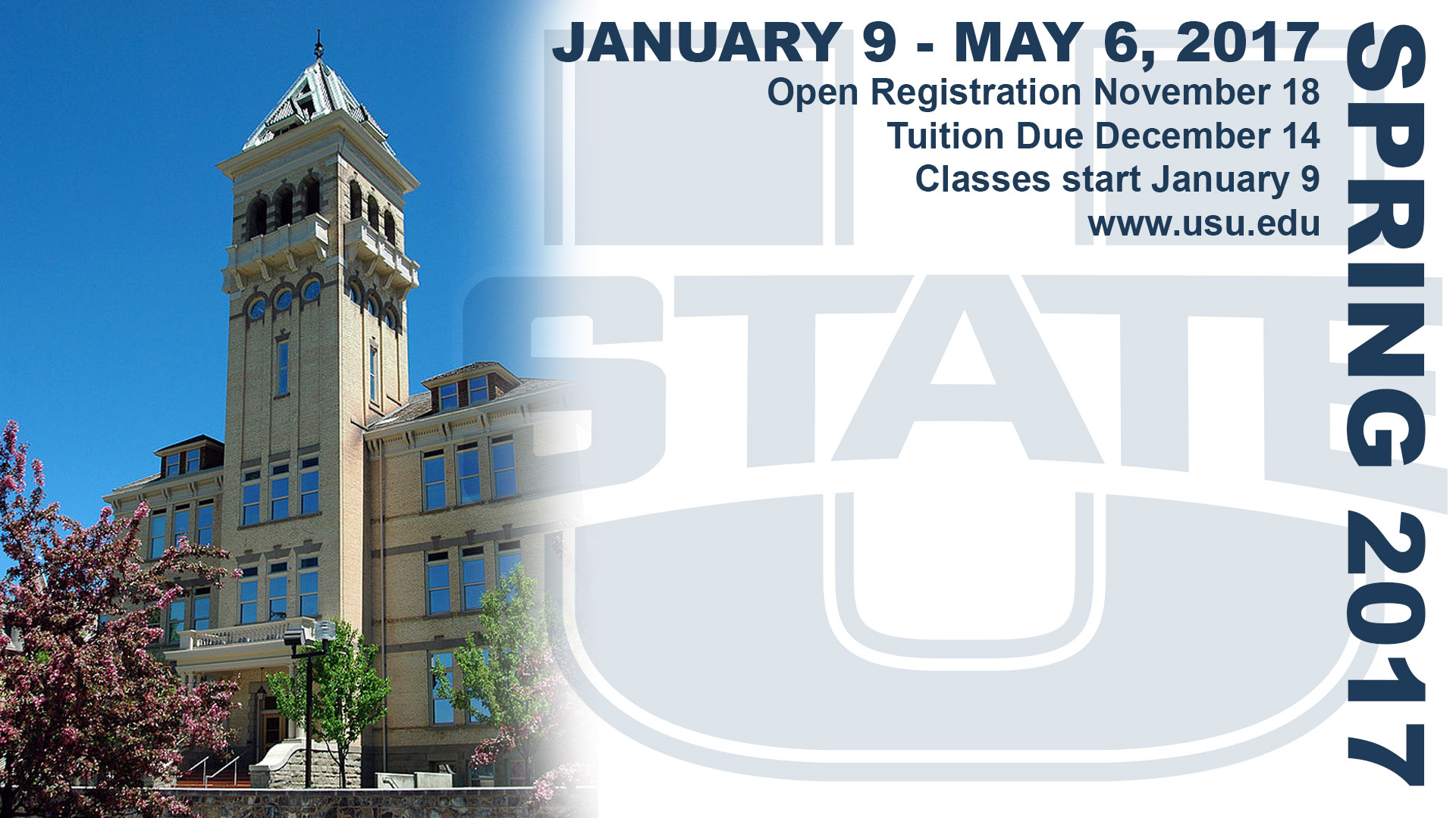
This digital display was created to inform Utah State University students of upcoming dates associated with the Spring 2017 semester.
This digital display was created to inform Utah State University students of upcoming dates associated with the Spring 2017 semester.
- Contrast: The dark lettering contrasts with the white space, background logo, and photo. The caps lettering contrasts with the lowercase lettering.
- Repetition: The color of the text is the same as the original logo. All of the text uses the same color.
- Alignment: The side text is on the right, and the rest of the text is justified right as well. The top of the text is aligned with the top of the side text. The main text is aligned on the left with the edge of the image.
- Proximity: All of the information is located close in proximity, drawing attention to the text on the page.
- Color: The text and the logo are the same color, but the opacity of the logo has been decreased to show contrast. A shade of blue is also part of the photo.
- Typography: The same font was used throughout the display for repetition purposes. However, the side text is in a Black bold style and all caps, the main header is in Bold style and all caps, and the main body of the text is in Bold style without caps.
- A mask was used on the photo to fade out the right side of the photograph and blend it in with the white background.
- The logo was created using a Hard Light blending mode and a significantly decreased opacity.
- The Eyedropper tool was used on the original logo to obtain the color for all of the text.
- The Free Transform tool was used to place the text.
- A Hue/Saturation Adjustment Layer was added to the logo, and clipped to change just the logo.
- Images from: https://en.wikipedia.org/wiki/Utah_State_University & https://en.wikipedia.org/wiki/Utah_State_Aggies
- Font Used: Arial
