Exhibit 3 - Blurring
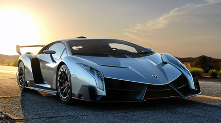
Before
|
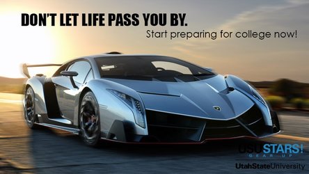
After
|
Design Thoughts:
This was designed to be a poster to promote the USU Gear Up program.
Images from: http://www.newtimes.gr/ & http://www.davis.k12.ut.us/domain/12529
Design Thoughts:
This was designed to be a poster to promote the USU Gear Up program.
- Contrast: The sharper image of the car contrasts the blurred background image. The black text contrasts the lighter background.
- Repetition: Black color is repeated in the text above the car and in part of the logo.
- Alignment: The left text is aligned with the left edge of the car. The right text is aligned with the right edge of the logo.
- Proximity: The text is all close in proximity above the car, with just a logo at the bottom left.
- Color: I tried to match the color of the logo closely to the color of the car.
- Typography: Two complimentary fonts were used, one in all caps and bold for contrast. Both fonts coordinate with the font used in the logo.
- I duplicated the background layer.
- I used the Quick Selection tool to select the car and added that selection as a new layer.
- I added a Motion Blur Filter to the copy of the background layer.
- I selected each tire and added a Radial Blur Filter.
- I added a slight Gaussian Blur Filter to the car selection.
- I added two Text layers.
- I added the logo and used the Free Transform tool to adjust it's size.
- I added a Curves Adjustment Layer to just the logo to adjust the blue color of the logo to more closely align with the vehicle color.
Images from: http://www.newtimes.gr/ & http://www.davis.k12.ut.us/domain/12529
