Exhibit 6 - Infographic
Design Thoughts:
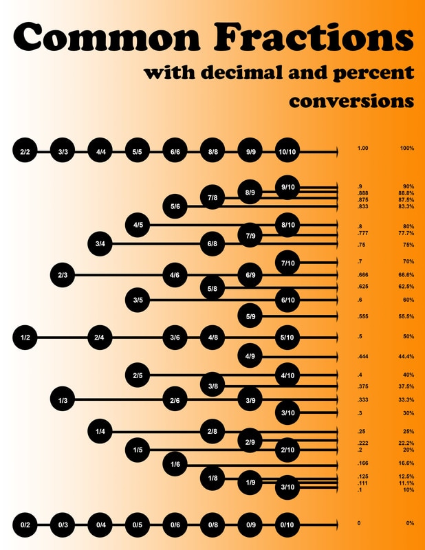
I wanted to create something that I could actually use as in my profession as a math teacher, so I created this infographic about fractions, decimals, and percents.
Fonts used: Cooper Black & Arial
I wanted to create something that I could actually use as in my profession as a math teacher, so I created this infographic about fractions, decimals, and percents.
- Contrast: Contrast is created by using a gradient on the background. The dark text also creates contrast with the lighter background. The white text creates contrast with the black background. The title and numbers are also in different fonts.
- Repetition: The same arrows and circles are used throughout the image.
- Alignment: The title is aligned left with the circles, and right with the numbers. The circles and arrows all align left to right, and point to the corresponding decimals and percents. The arrows all end in alignment. The numbers on the left are all aligned.
- Color: Color was added to the background as a gradient, and black and white only was used to create contrast for the rest of the design.
- Typography: Only two fonts were used, and create contrast as one is sans-serif and the other is serif.
- Many, many, many guide lines were used to make sure that all the circles, arrows, and text were aligned.
- The Elipse Tool was used to create the circles. Then I used the shortcut Alt+Ctrl+T to copy and move the new elipse. Then I used the shortcut Alt+Shift+Ctrl+T to continue to duplicate and move all of the elipses.
- The Line Tool was used to create the lines with arrowheads at the end.
- The Text Tool was used to create all of the numbers and title.
- The Gradient Tool was used to add the color to the background.
Fonts used: Cooper Black & Arial
