Exhibit 9 - Text Effects
Design Thoughts:
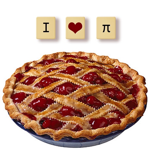
I wanted to create a fun image for Pi Day.
I wanted to create a fun image for Pi Day.
- Contrast: Contrast is created by using a bright image with a white background. The letter tiles also stand out from the back ground because of the use of a drop shadow.
- Repetition: All of the tiles are copies of one another, so they create a repeating pattern. The color of the heart is the same as the color from the cherries.
- Alignment: All the tiles are aligned and centered horizontally.
- Proximity: The tiles are located closely together because they are similar. The tiles are on the top third of the page, an the image is on the bottom two thirds of the page.
- Color: The color of the heart is the same as the color from the cherries. The color of the tiles is in the same family as the pastry, but just a lighter hue.
- Typography: A simple serif font was used for the text to mirror the look of a Scrabble tile.
- The pie image was addeda dn the Free Transform tool was used to resize and place the image in the right spot.
- The Rounded Rectangle Tool was used to create one tile.
- The Drop Shadow, Bevel, Contour, and Gradient Overlay Layer Styles were added to the tile.
- A text layer with a slight Drop Shadow Layer Style was added on top of the tile.
- The tile and text layer were grouped together and then duplicated to create the other two tiles.
- The text layer for the heart tile was deleted, and the Custom Shape Tool was used to create the heart. The color of the heart was selected using the Dropper Tool on the cherries.
- The text layer style from the other tiles was copied to the heart shape.
- A Gradient Map Adjustment Layer was added, and it's Blend Mode and Opacity were adjusted.
- All layers were dupicated and then Merged, and the Blend Mode and Opacity were adjusted.
- A High Pass FIlter was added.
- Font Used: Consolas
- Image From: http://kingofwallpapers.com/pie.html
- Photoshop tutorial from: http://textuts.com/scrabble-tiles-text-effect/
